It is not from one image uploaded to Kuler because most of
the upload results had very similar results between different
images. I know that these results being similar is a clue that
i should probably use these colors for my site but i wanted
to try something a little different.

I took the less saturated colors out of a few of the Kuler results
to put together a scheme that i think will work. The design is very
basic but the center dividing line resembles processed B&W film
which, although most of my work is digital now, i still used when i
have more time or think a shot will have better results with film.
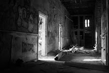
I want the colors of the images like this one that will be in this site
to add the brighter accent colors.

No comments:
Post a Comment